1. Option 1 view angle is just more aesthetically pleasing.
3. i just feel like it
4. Option 1 has smaller black area that is less distracting than option 2.
5. option 2 had a bigger empty black space option one just looked more appealing.
6. There's less empty/dead space at the time unlike option 2.
8. the header is weird in second one
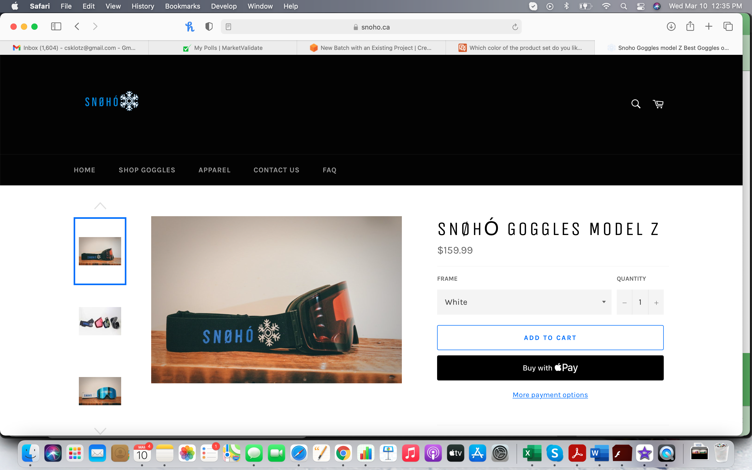
9. I prefer this one. It shows the product the best. I don't care about side view.
11. they look a little better in my opinion and I think they would provide a little better protection.
12. its good like it
13. I think it's more eye-catching to see the reflection of the goggles. It caught my eye first.
15. I like the color scheme of option 1 the best.
16. I like Option 1 as I think it really shows off how sleek the design of the goggles is form the front. The side view if fine, but I think the front view looks much more modern.
17. I chose option 1 because the top banner isn't as big and distracting. I can see almost all of the information of the product without having to scroll much.
20. It was clear to watch
22. I like seeing what the product looks like from the front because that's what people are going to see when I'm wearing them.
24. You can see a better view of exactly what the product is and you can see exactly what color the lense is a lot better
26. Option 1's darker colors makes it look more modern and unique, compared to the lighter colors of Option 2.
27. I like being able to see typed information at the bottom
29. Option 1 gives a better view of the style of the goggles.
30. Most of us care about how it looks from the front.
31. I chose the facing front option because it appears more assertive.
32. it gives you a better presentation due to the symmetry and the vibrant color
34. Less black space. The item is displayed more prominently.
35. 1st because here we can see front and side look both together.
36. Option 1 has less of the black header. It takes up too much of the space in the second presentation.
37. I dig the front view. Looks like it's greeting me and wants me to acknowledge it.
38. it looks very cool
42. I'm not a huge fan of the massive black banner. I like having a bigger banner, but some designers will add some images underneath it, with the banner being somewhat transparent. This one is just huge and blocky, and I don't know why. I don't like it. I chose option #1 because it just looks more pleasing, and what I would expect.
43. In Option 1 you can see the front of the product better, which is more important to me than the side view since the front is what everyone would see so I'd want to make sure I like it.
44. i can see what the google look like in the mirror or for others
45. it looks very cool
46. I like the presentation in option 1 better. This view is more clear and gives the viewer an easy angle to look at the product.
47. it looks very cool
48. bright & visually appealing; option 2 is too dark with the large black rectangle at the top
50. I love seeing both the side of the goggles and the front. It looks really good!
53. I can see what it would look like on my face easier.
54. I like the front view best for a few reasons. One, the blue reflection catches my eye. Second, I know exactly what the product is by looking at it straight on. The option 2 photo is ok, but the first is much more pleasing to look at.
17 Responses to Option B
17 people chose B as their choice
2. More simple and straight to the point
7. this is more beautiful and standard i think
10. it is good view in my own thoughts
14. Option 2 is easier to see.
18. clear image and description details
19. I felt that was the better choice
21. Its more appealing and clear
23. The side view is best because you can see the whole item, including the strap and nose piece.
25. The photo has very nice and appealing colors.
28. I like the larger format.
33. It's more clear that it's goggles in option 2
39. I chose option 1 becuase i could see the product and the color is nice.
40. Because the photo shows both sides of the object
41. Clarity is good
49. This color looks better this way but if it were green like the other image, it would not.
51. Option 2 is more aesthetically pleasing.
52. Side view is best because it shows the orange tint of the lens and the company logo, neither of which or visible in the front view.
Demographics
Manage pending orders and track invoices.
Gender (Personal)
Age Range (Personal)
Share Your Results
Anyone with the following URL can see these poll results.